At SR/A we recognize the value of thoughtful interior design; be it a medical office or an amenity space in a multifamily housing building. Beautiful and functional design can significantly increase a space’s appeal to potential customers while also promoting a positive work environment for employees – a win-win situation for most business owners! Good interior design will improve clients’ experiences with your business and by extension make them more likely to become repeat customers. Contrary to what you might see on HGTV, good design (especially good office design), takes time. It follows a methodical process necessary to create functional, aesthetically pleasing, and thoughtfully crafted spaces. Let’s explore the following case study, “Smile Bright Dentistry,” a dentist’s office designed by SR/A to better underscore what it takes to create the ideal environment for building and maintaining clientele, retaining happy employees, and seeing your business flourish.
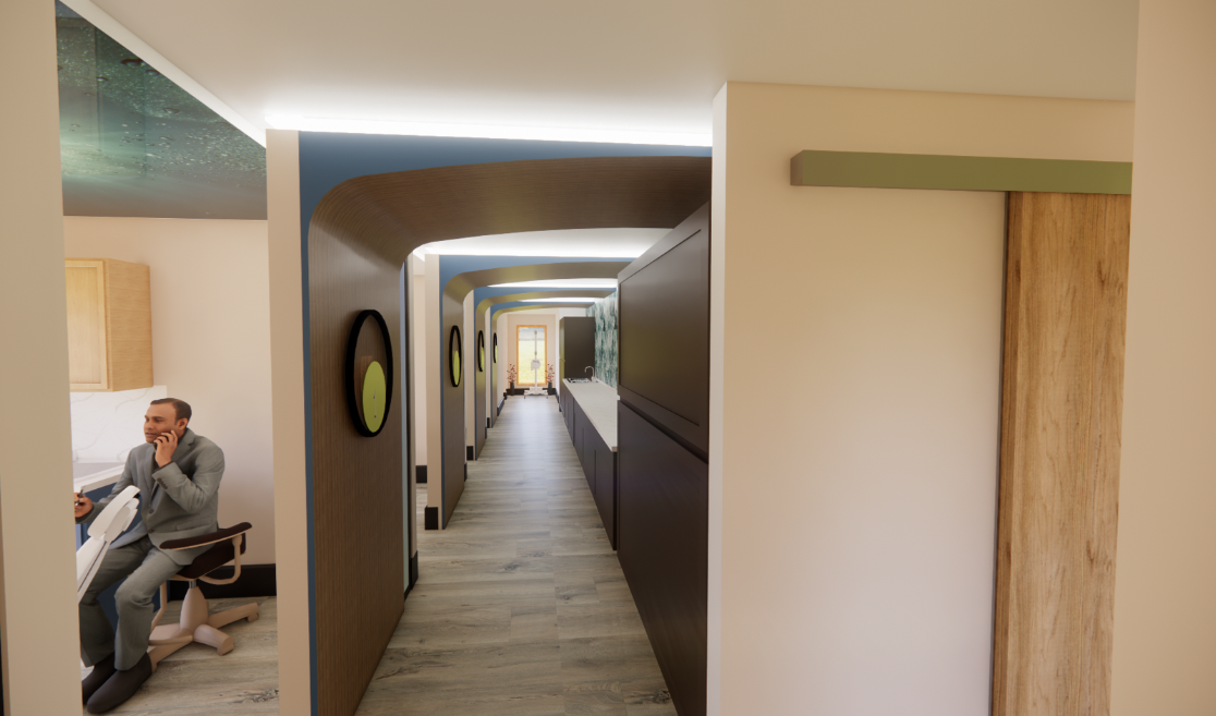
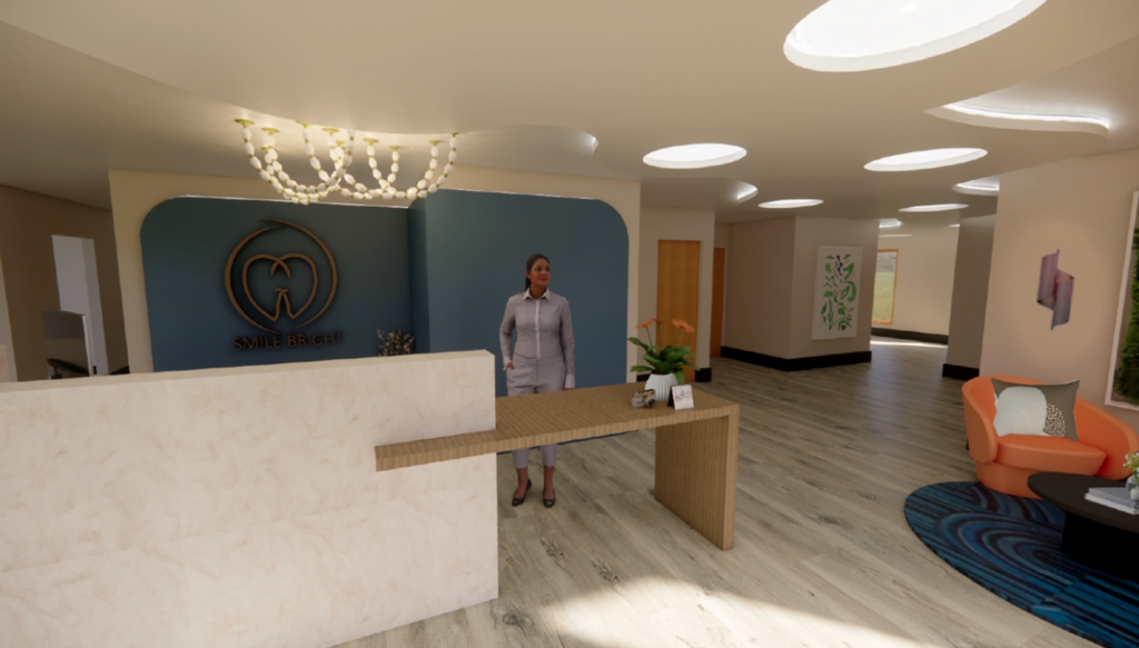
Functional Workflow: A critical first step to successful design is an evaluation of the space and furniture layout options. We research the requirements and needs required for a flawless experience for both clients and staff. By optimizing the space planning, SR/A maximizes operational efficiency and productivity while enhancing circulation and flow for clients. For instance, at Smile Bright, we produced that sense of flow through spatial organization and directional cues. We developed an organic-looking ceiling at the entry that extends all the way to the back to provide fluidity while at the same time offering a visual wayfinding clue to clients that this is the way to move through check-in to get to your appointed exam room. In addition, space planning was optimized to allow staff members easy travel between rooms, access to tools, and organized storage. We believe this workflow-driven design approach results in an enhanced model of patient care and elevated productivity.

SR/A Designed Case Study – Smile Bright Dentistry Reception Area
Design Concept/Branding: Developing a design idea for the space and maintaining branding consistency is a crucial, and SR/A works closely with all our clients to achieve this. What sets any business apart is its unique values and cohesiveness. With the Smile Bright project, our concept was to create a spa-like atmosphere using neutral tones, greenery, and a pop of colors to add a fun touch to the space. The calm palette is visually appealing on an aesthetic level, and the infusion biophilic elements in medical environments has been shown to improve experiences and outcomes for patients. We designed a sleek concierge desk in earth tones and brought key branding elements into the space. To emphasize Smile Bright’s brand, we designed a logo wall and contrasted it with a blue accent fabric. The design intent for the waiting area was for the client to enjoy the waiting and check-in experience by establishing a relaxing, spa-like environment rather than your typical, sterile dental office. SR/A always researches precedents when developing our design concepts. The use of blue accent colors throughout was intentional for the dentist practice; according to some dentists, dark blue will reflect a brighter smile!

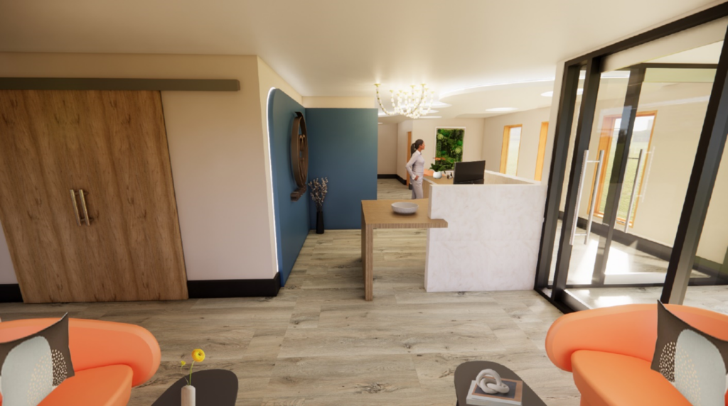
SR/A Designed Case Study – Smile Bright Dentistry Exit Reception Area
Hospitality: A secret ingredient for any space is to be welcoming and give people a place where they feel at ease! Establishing a friendly and welcoming environment contributes significantly to client satisfaction and loyalty. A pleasant entry and a greeting from the front office staff will instantly lift your mood! In the Smile Bright Case Study, we incorporated hospitality-inspired elements by adding comfortable lounge seating, a textural area rug, fun accessories, art, and elegant lighting.

SR/A Designed Case Study – Smile Bright Dentistry Exam Hallway
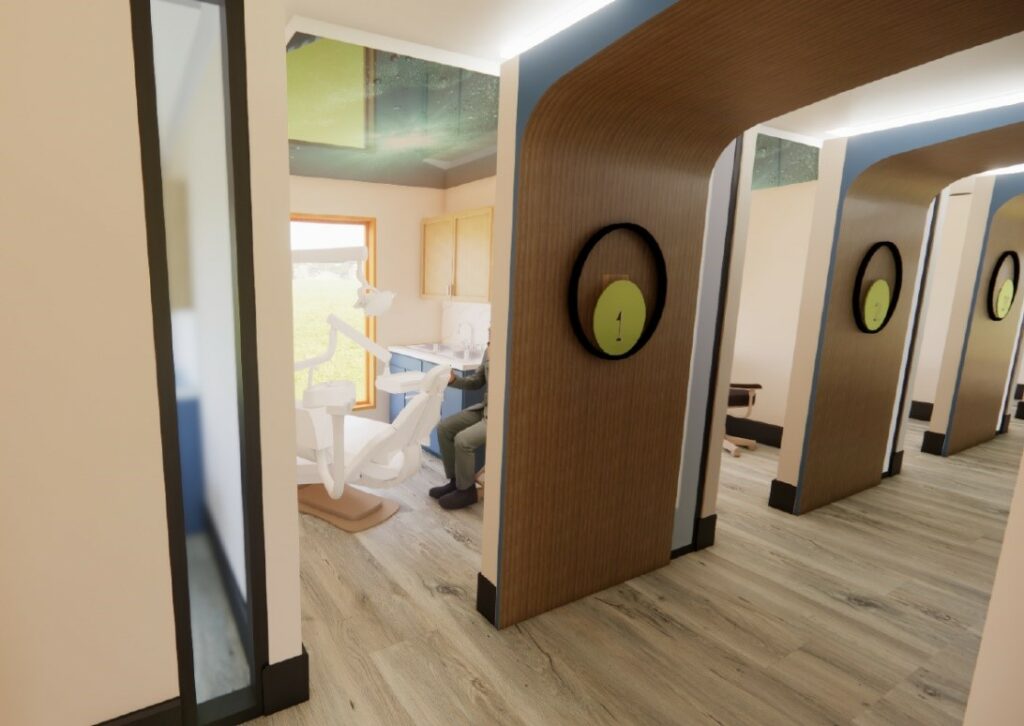
In the examination rooms, we focused on what clients would be looking at the most during their time spent in a dentist’s chair – the ceiling! Overhead projection screens with calming scenes depicting nature were incorporated to sooth and calm patients during their dental procedure. An additional design element we incorporated into the exam spaces was the use of lighting and large-scale room numbers. These elements serve several functional purposes from providing additional lighting sources to the hallway outside the patient exam rooms (a plus for staff and patients) as well as wayfinding guidance for patients as they navigate to the room where they will meet with their provider.
Conclusion: The journey to revamp or build an ideal office that will attract and retain loyal clients is a momentous effort, but, as this case study shows, it can be a fun and thoughtful one with the help of a creative team. SR/A is ready to be the design partner that can take your spaces to the next level! Let us help you build your dream practice. Give us a call or send us an email at info@srainteriordesign.com
Amina Elshaer is a Junior Designer at SR/A.