By Amina Elshaer
This year, SR/A successfully wrapped up The 202 project, located in the heart of Washington DC. It has been an incredible journey marked by unforgettable experiences and innovative progress. Among the various aspects of the project, one significant area SR/A focused on was the Model Unit, overcoming the challenges of optimizing space within a small square footage. In today’s blog, we’ll explore a case study that showcases the essential steps taken by SR/A to turn the model unit into a unique residential space.
Creating Zones
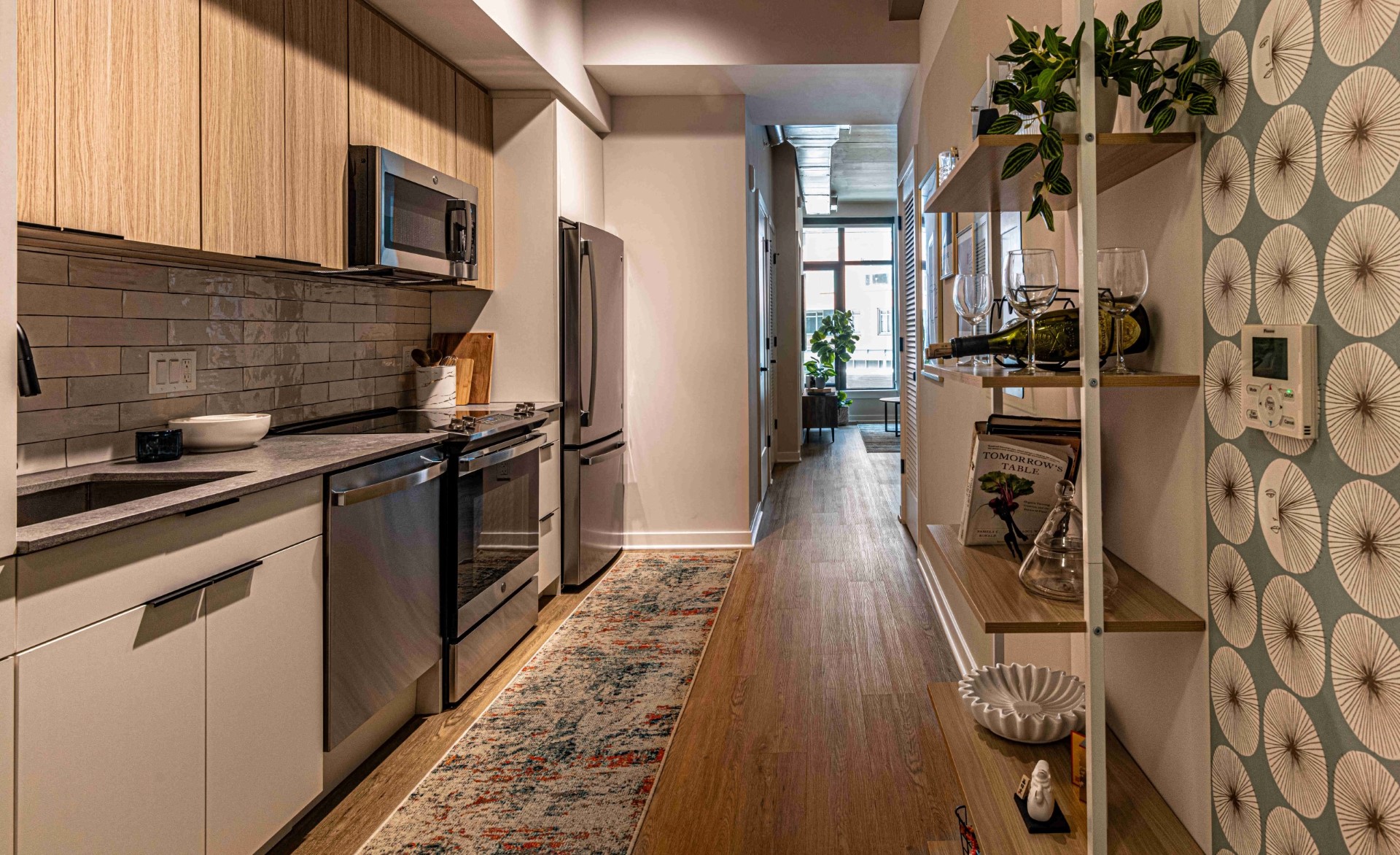
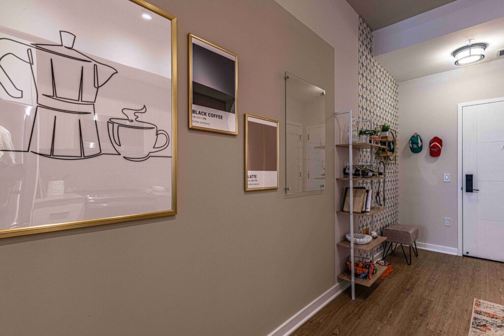
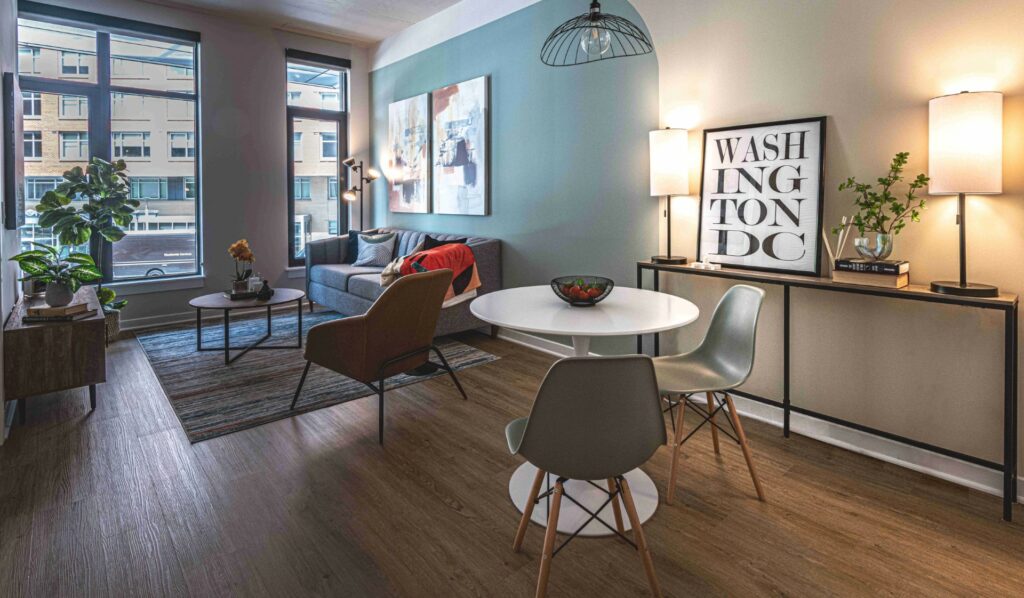
SR/A Interior Design believes that compact spaces provide limitless chances for innovation. In The 202, we’ve embraced the challenge of working with small square footage, focusing on clever design solutions that improve both practicality and appearance. A key strategy in our approach involves skillfully dividing the spaces to create distinct zones. In this unit, faced with the challenge of a long entry hallway and narrow living/dining areas, SR/A developed a creative solution to create the illusion of separate spaces. By developing a featured wall design using accent paint and wallpaper, we successfully divided the space into functional areas. For instance, at the entrance, we utilized wallpaper to delineate an inviting foyer and switched to a block paint design to highlight the kitchen hallway with a gallery wall. Moving to the living/dining space, SR/A introduced an accent paint color, to define the living space, while opting for neutral hue for the dining by using a color block design. Overall, the featured wall design specifically highlighted these areas and effectively created zoning within the spaces, fostering an inviting atmosphere.

Optimizing with Furniture selection and layout
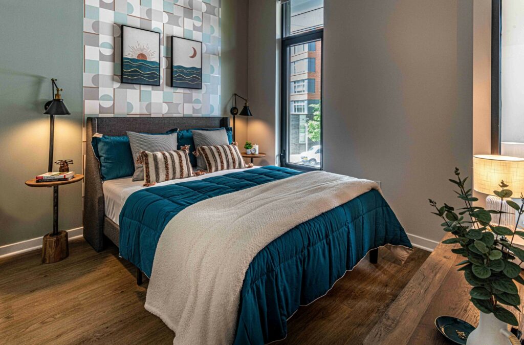
Furniture selection and layout were other key strategies in SR/A’s approach to staging the Model Unit. When working with a confined space, every piece of furniture matters. We meticulously chose furniture that was properly proportioned, had a sleek design, and served multiple purposes, aiming to visually enlarge the space and offer additional storage/display options. Furniture was utilized to establish transition within the spaces. For instance, shelving was introduced to create separation in the hallway between the entryway and the kitchen, providing both a stylish display and a storage solution for the kitchen. Similarly, in the living/dining space, the console table and lamps were strategically placed, serving as transitional elements and creating a distinct atmosphere for the dining room. In the bedroom, we decided to use wall sconces instead of table lamps, aiming to maximize the functionality of the nightstands and increase the brightness of the space. Overall, SR/A took advantage of the vertical space, opted for a sleek, minimalistic furniture in optimal quantities to cultivate an open atmosphere without overwhelming the spaces.

Adding bold colors and lighting
SR/A Interior Design integrated the use of lively and vibrant colors through accessories to infuse each space with character and to echo the artistic essence of the neighborhood through its stunning and colorful murals. Within this unit, we embellished the spaces with colorful accessories, including vibrant pillows, bright, cozy throws, interesting artwork, and quirky touches to help enhance and uplift the mood and leave a lasting impression. Moreover, SR/A used a variety of lighting fixtures, including pendants, table lamps, sconces, and floor lamps, to infuse dimension and depth into the spaces. Coupled with the natural light, the space appeared more spacious and elevated the overall ambiance.

Conclusion
SR/A Interior Design has taken great pleasure in enhancing the Model Unit at the 202, embarking on a rewarding journey filled with immense satisfaction. SR/A is prepared to serve as your design partner, elevating your spaces to new heights. Allow us to be your go-to choice in bringing your dream spaces to life. Give us a call or send us an email.