In the field of interior design, the type of work you practice normally falls into one of two categories- residential or commercial. Because commercial designers are ethically and legally tasked with considering the health, safety and welfare of the people who will be using the spaces they design, their work differs considerably from what one sees on HGTV or DIY network.
Popular television design programs center upon residential designers who are so well known for their distinctive style that retailers will team with them to develop and sell their “look” in furniture, housewares, and accessories. A designer may be specifically hired solely for the aesthetic they bring to each project. In the residential sphere a designers’ visual style is the key to their success as seen in Kelly Wearstler’s maximalism or John Pawson’s minimalism.
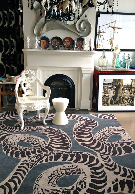
Kelly Wearstler’s Maximalism Design 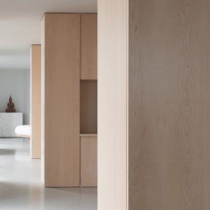
John Pawson’s Minimalism Design
Commercial design firms must practice aesthetic versatility or risk limiting their range of clients or projects. Every person has their own sense of style and this is doubly true of designers. Oftentimes you can guess at a designer’s home by how they dress. We may embrace a strong combination of bright colors and a variety of pattern or prefer a neutral, more textured look inspired by Scandinavian or Japanese design. Yet, when we are at work, designing a nonprofit’s new office or the children’s wing of a hospital, personal tastes are set aside. Several factors are paramount in determining the visual concept: the space, the budget, and the client’s goals. SR/A Interior Design project Fenwick Apartments illustrates how the client’s goals impact the final design.
Once all contracts are official, one of the first exchanges between client and designer is a briefing on the client’s goals for their project.
What is their brand, and to what extent should it play into the design?
For a multi-family building, what demographic are they trying to attract? How do they differentiate their project from the competition?
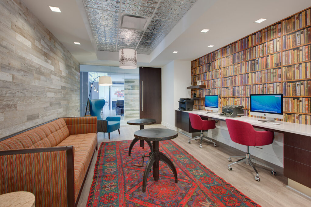
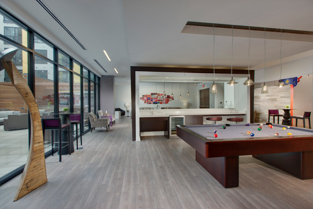
The developer of Fenwick Apartments in Silver Spring asked for a design that is eclectic, bohemian, unexpected and with touches of wit and playfulness. SR/A designed the library shelf wall covering is witty and unexpected, as one expects to find actual books on real shelves. The bright, patterned rug and reflective tin ceiling add a touch of bohemia as do the eclectic styles of the furniture pieces.
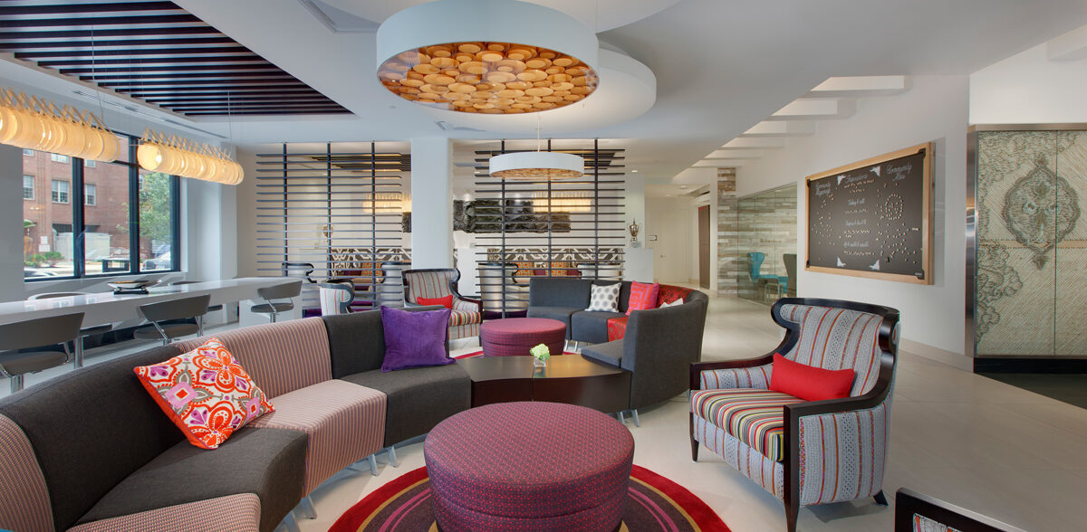
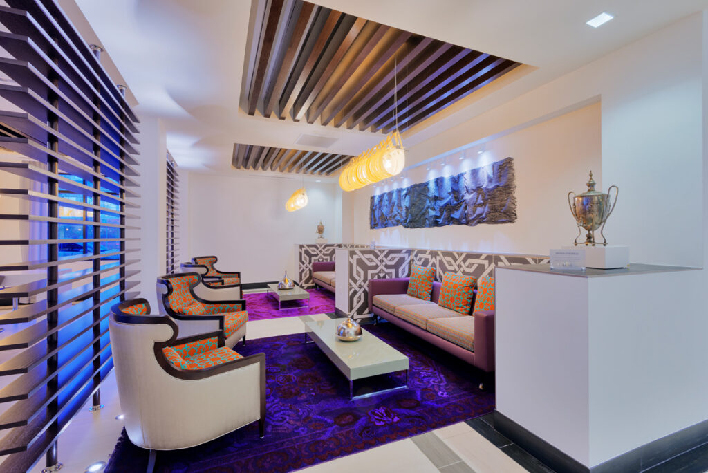
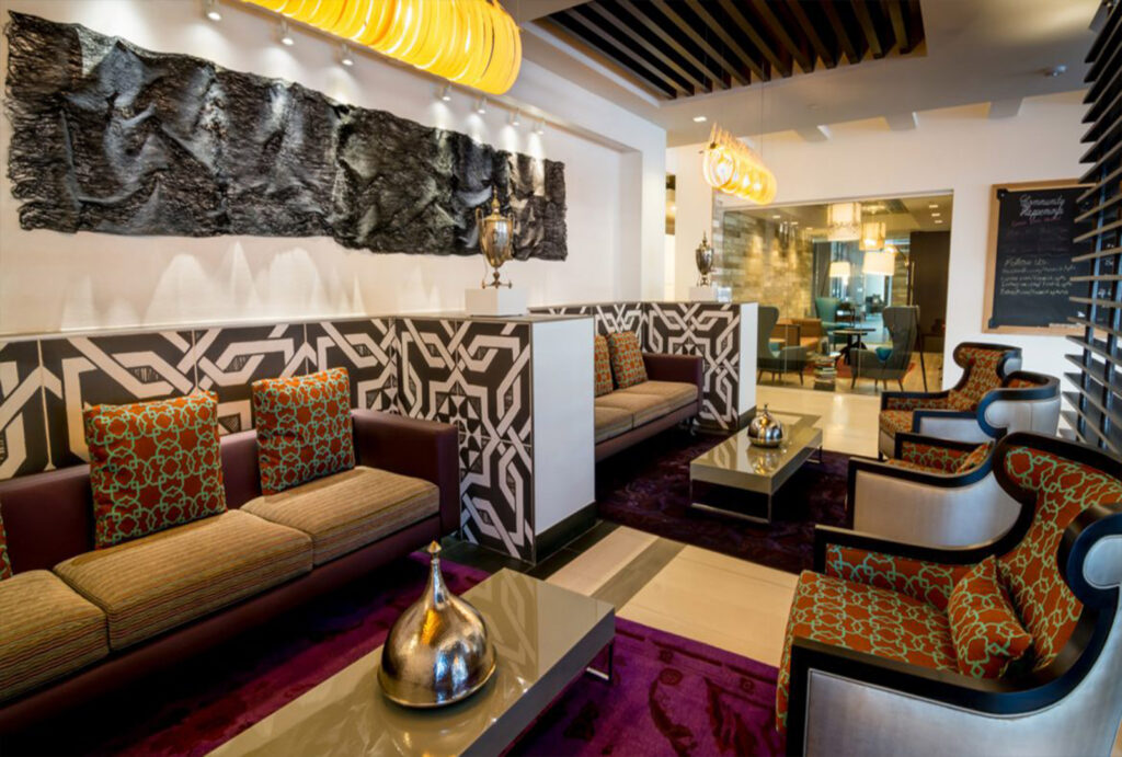
The building program directed the design team to “create great spaces for socialization and community building. Places where people can watch and be watched; think open yet, intimate.” The design team, led by Jessica Watts, created the perfect unexpected spot in the lobby to watch and be watched: The Tearoom. Wood slats set the space apart while allowing for views in and out. The client’s wish for traditional styles in modern shapes or materials was met with wingback chairs that feature smaller, rounded wings. The juxtaposition of the “wrinkled” art and the rounded lighting fixture is playful and eye-catching. With thick area rugs and deep banquette seating, the Tearoom is perfect for socializing with fellow tenants or visitors.
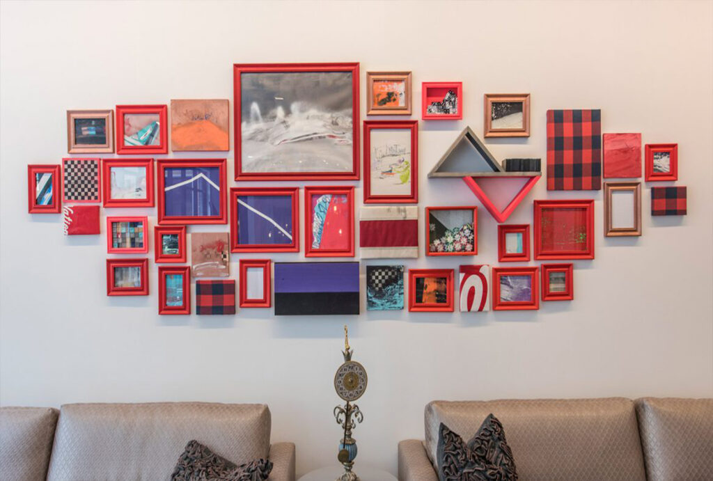
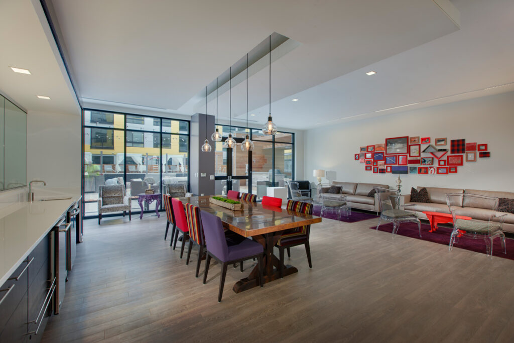
Another great space for community building is the club room. The use of bright colors, striped fabrics, and furniture styles continues the witty and playful spirit one expects from earlier spaces. The “ghost” chairs are a clever spin on a traditional shape, while allowing the seating arrangements a sense of openness. Your eyes can take in the custom art arrangement – a great conversation starter.
The SR/A team’s approach of thoughtful, original, and versatile design has helped make the Fenwick a standout place to live within the culturally rich community of Silver Spring, MD. Please check out more of our completed projects by visiting our portfolio, here.
About the Author:
Dawn Hershberger is a Junior Designer at SR/A Interior Design. She enjoys each part of the design process for its own unique challenges and blend of creativity, analysis and research.
