Every design project comes with a unique set of challenges and goals. As a design firm, we see these challenges as opportunities to problem solve and to create solutions that will positively impact the end-users. An obstacle that long-term construction projects often face is that the designers are introduced to a project far ahead of the official install date. Construction at this scale often takes a lot of time, therefore there are many unforeseen circumstances that can occur such as a hold up in permitting, a hiccup with financing, or even tumultuous weather.
For instance, it was 2014 when SR/A began working on Solaire 8250, a multi-family building in downtown Silver Spring. Solaire 8250 finally opened this past spring so for us, starting many years in-advance required forward-thinking. Simply following at-the-time trends will not appear fresh once a building is completed in the future. Therefore, designers must dig deep into their creative souls to develop concepts that will not only set new trends but will also not quickly age; which could require extensive (and expensive) renovations. In this project, SR/A was tasked with coming up with a design that would resonate with a millennial population, infuse color in unexpected ways, and make a statement in an area being heavily developed.
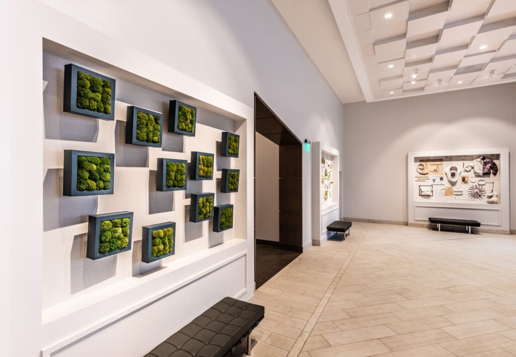
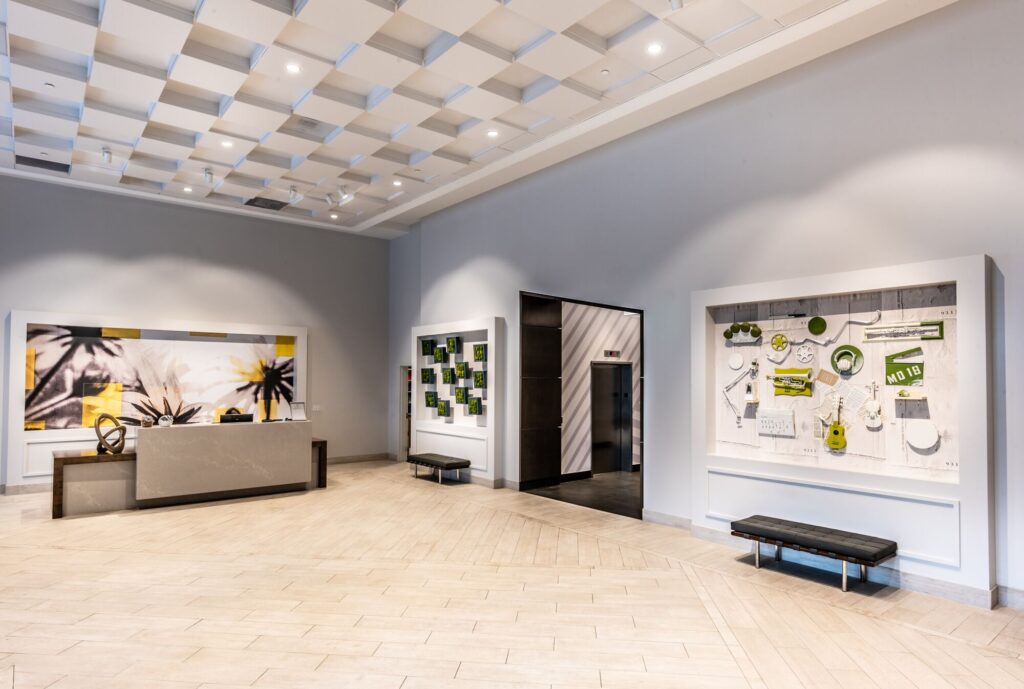
The aesthetic features of a building begin to take shape after a process called “Schematic Design” in which designers, architects, and clients settle on the project scope and ultimately work out all the space planning details. One of the first areas that sets the tone for the building is the lobby. SR/A’s vision for Solaire 8250’s lobby was inspired by the essence of an art gallery. We wanted those who entered the building to be inspired and surrounded by creative energy – similar to a gallery visitor’s experience. In addition, we desired to create a space that accentuated the volume, used a neutral backdrop, and incorporated many eye-catching elements – primarily custom art installations.
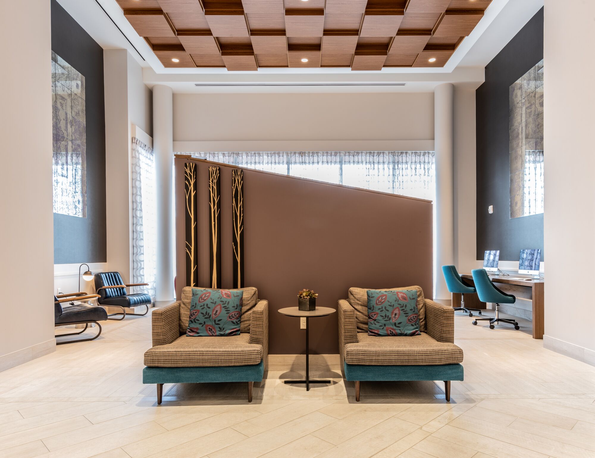
The high ceilings were finished with a modern, protruding geometric ceiling panel system by Armstrong. Most of the ceiling was specified in white to meet the desire for a neutral backdrop and to also emphasize the high ceiling. However, a wood finish was specified in the seating area to provide added definition to this zone.
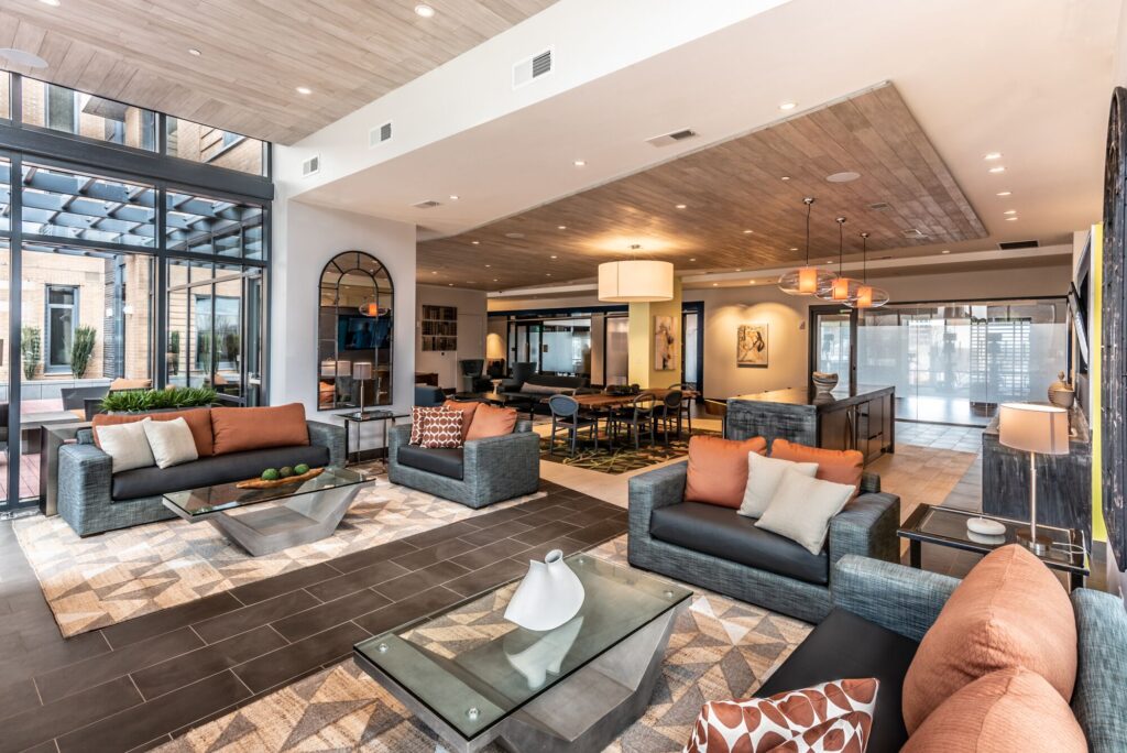
Strategic angles at the hospitality bar wall and elevator foyer opening work to bring eyes upwards while also creating added architectural interest in the space. For a unique and truly custom flooring detail, the SR/A team designed a planked flooring pattern that plays with interesting angles by running the planks at opposing directions to create a fun visual experience upon entry. Color infused the lobby multiple ways. For instance, fabric and area rug selections were expertly made to add vibrant pops of color against the neutral backdrop. Custom mirror paneling, produced with a vintage-inspired pattern and purple hue, also contributed to a touch of drama and color on the tall walls.
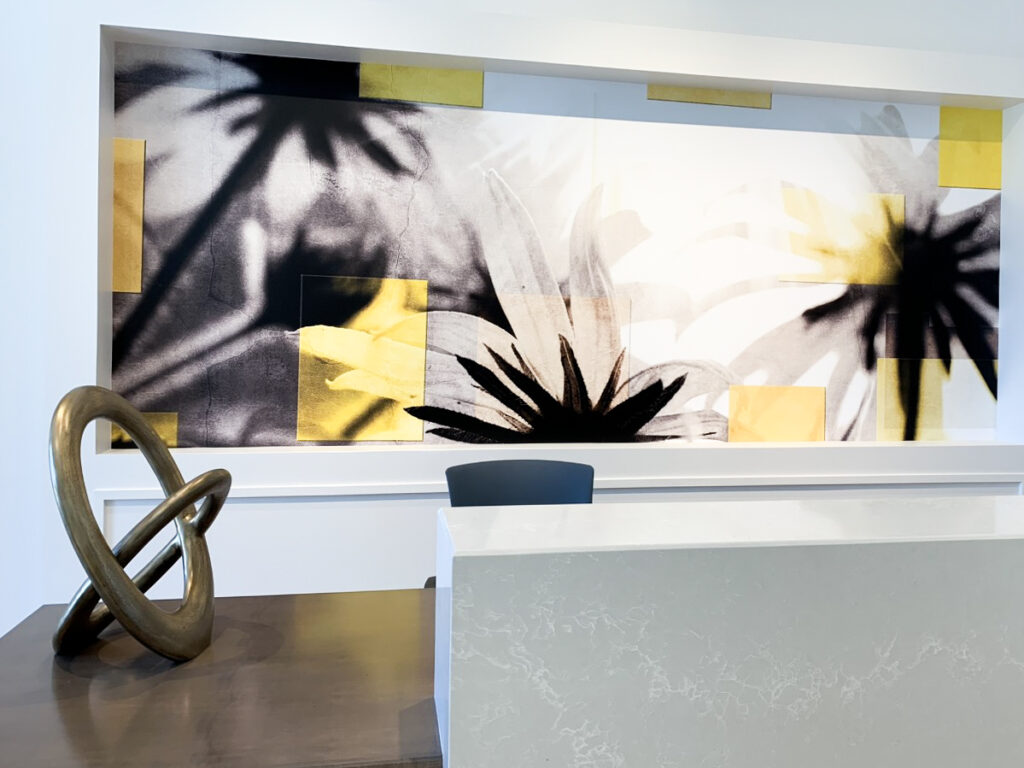
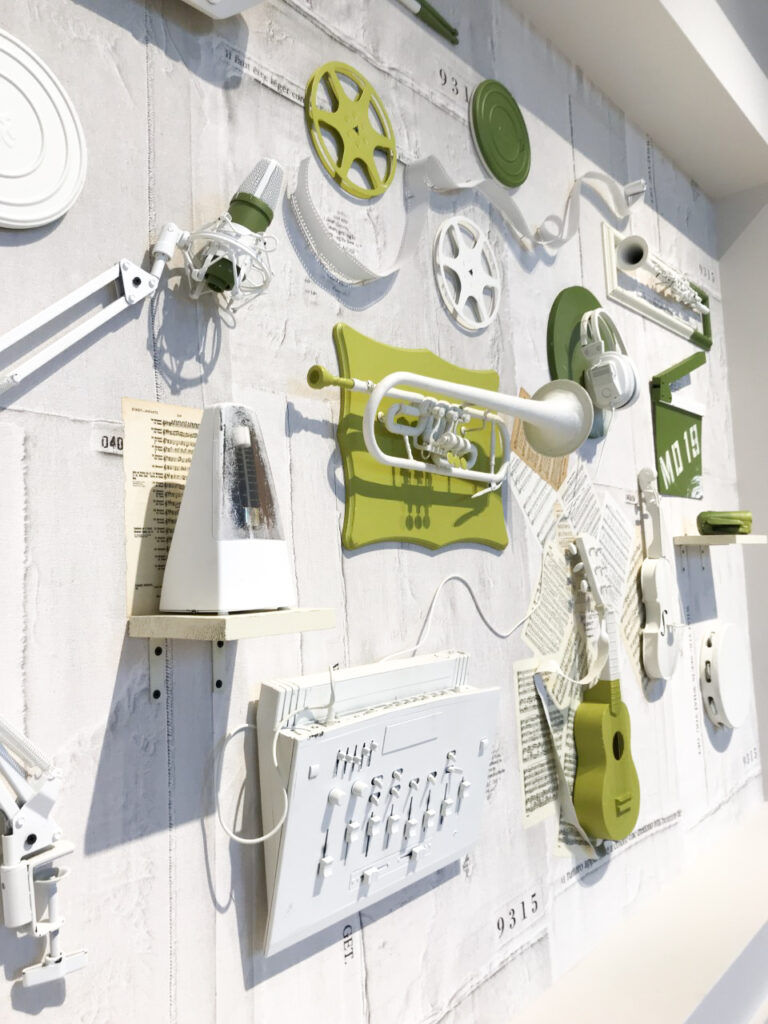
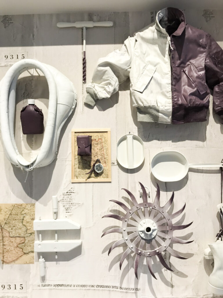
The curated art collection’s main mission is to steal the show in this lobby space. To do so, SR/A worked with artist, Anne-Marie Cherre, to create a three-dimensional art installation that highlights the history of Silver Spring’s past (in farming and armory/military) and present (in music and film). Objects representing this history are displayed and reimagined with pops of colors. Other art installations in the same space include a layered Black-Eyed Susan (Maryland’s state flower) graphic with highlights of yellow and a series of framed moss clusters. Each art installation was framed out on the wall to emphasize its prominence. Going with a neutral backdrop was essential to ensure that all of these complex design elements and pops of color could successfully work together in the same space.
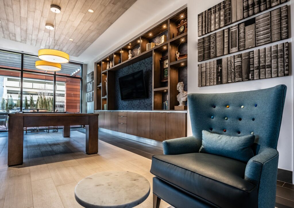
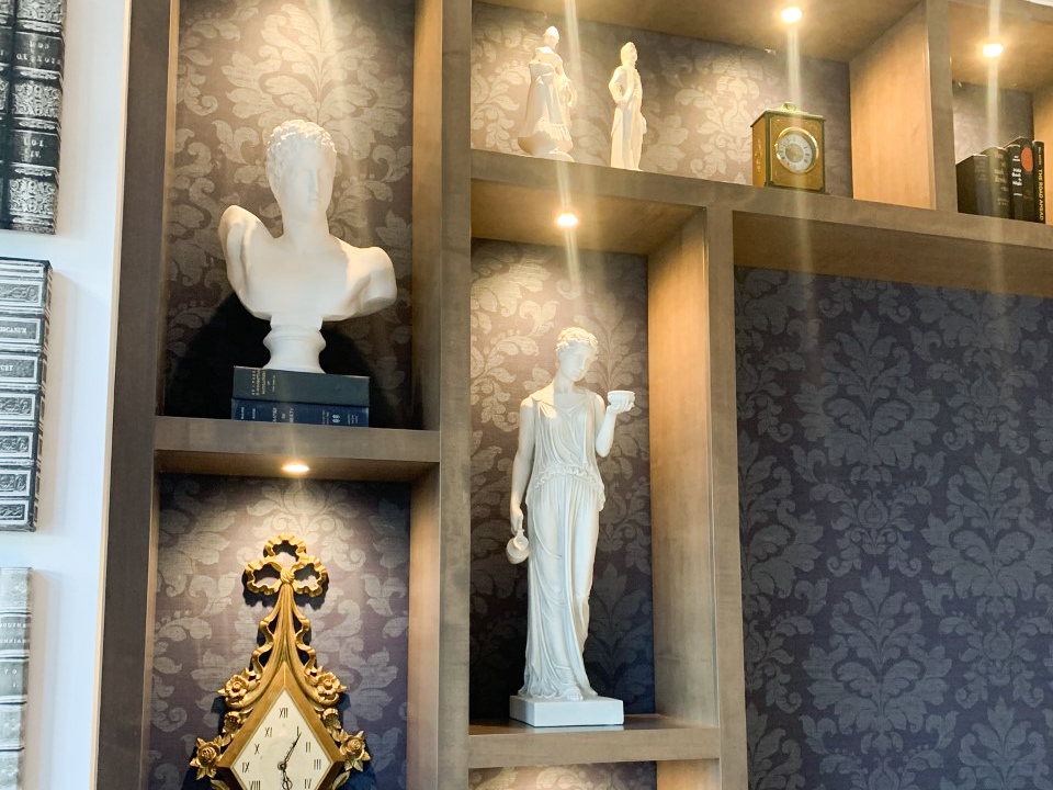
Once the lobby sets the tone for a building, designers can more easily begin to develop and finalize more design elements. Moving forward in the design process, SR/A drew inspiration from across the pond for colors, and several materials in Solaire 8250 reflect a British design sensibility. One obvious example is the large-scale patterned wallpaper in the first level powder room, that features colored pop images of the Queen herself. Other Brit-themed features include a colorful plaid floor tile in the club level restrooms, fabric and pattern selections in the club room, and a wallpaper shelf space showcasing funky busts in the library. Such boutique elements work to produce an ambiance that is eclectic, cozy, and modern – all wrapped into one.
Infusing color was a consistent design goal throughout the building. We decided to create a strong application of color at the wedge-shaped entry portal into the leasing office by painting it in an electric blue high gloss epoxy finish. The bold application of color welcomes tenants as they exit the elevator foyer and make their way into the amenity corridor. General artwork can be seen throughout the space, as well as a brightly colored ping pong table in the game room. Since design is in the details, it is also important to pay attention to lighting selections and even the corridor carpeting and elevator finishes. These examples were both opportunities to infuse color in unexpected ways.
Because the amenity spaces will be used for several functions, comfort and functionality were required in planning the design. Solaire 8250 is unique in the fact that the club and game amenity spaces were designed to be accessible 24/7 with no enclosures separating the space from the amenity corridor. When considering function in an amenity plan, it is important to provide several zones for multiple needs. There will need to be zones that accommodate different activities within a space – like active gaming zones or zones to curl up with a good book. It is also reasonable to consider that multiple strangers sharing a space will prefer a sense of privacy. The club and game room at Solaire 8250 successfully features:
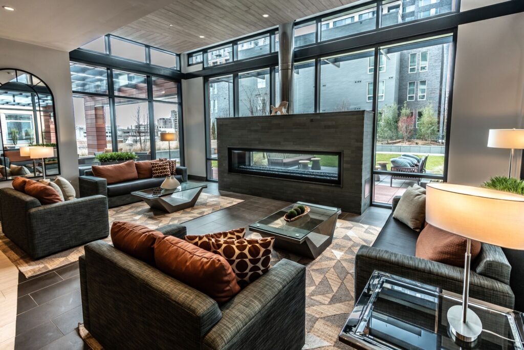
- A solarium nook with fireplace,
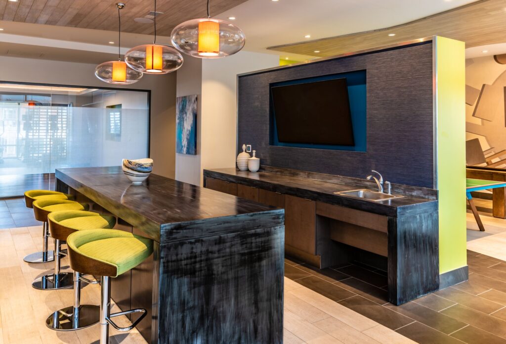
- A community table for dinner with friends or tackling homework
- A library area with ample seating and billiards
- A side room with active games – foosball, shuffleboard, & ping pong table
The team also took care to make sure that furniture selections not only achieved a high design level but also met the need of comfort for those using the pieces.
Exterior spaces are extensions of the building’s amenities, so we worked to make sure that selections of the outdoor furniture reflected design elements occurring within the interior spaces.
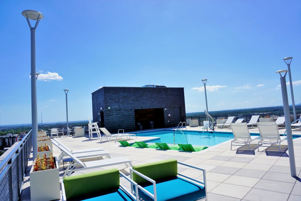
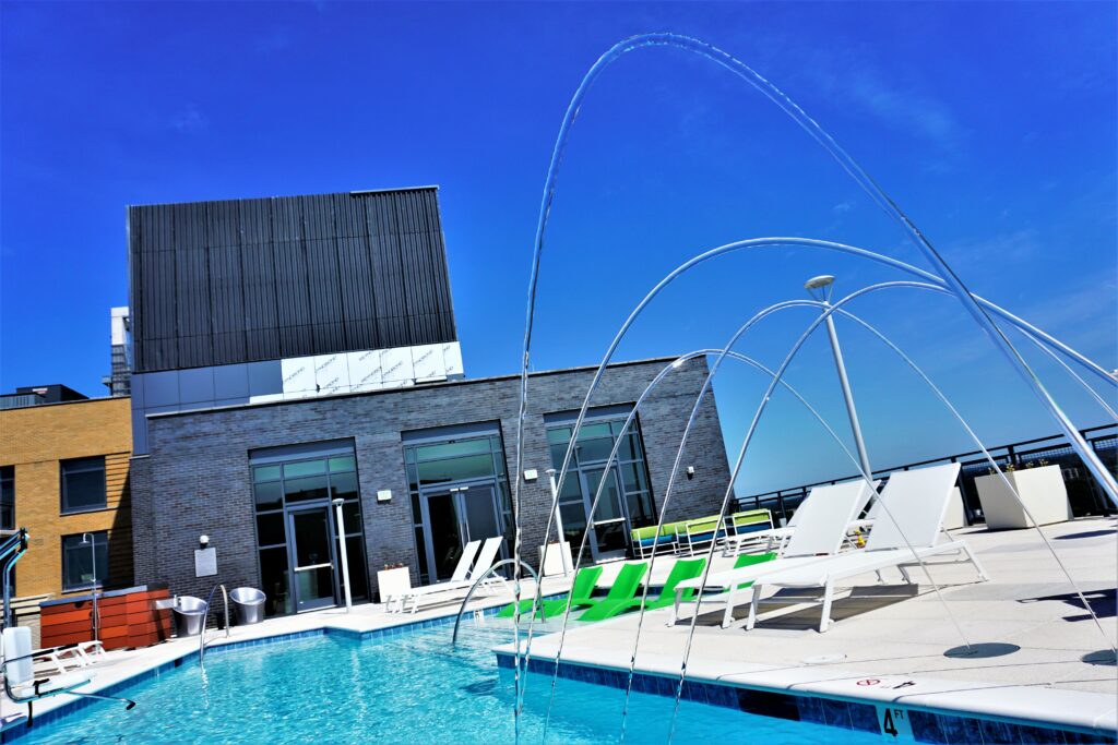
This was achieved through fabric selections and mixing furniture styles for a multi-dimensional experience. In addition, the building’s height is truly a selling point. With views looking all the way to downtown DC, the roof will surely become a favorite amenity among tenants. The roof features a pool and sky lounge – plus the perfect place to watch Fourth of July fireworks. SR/A wanted the sky lounge to blend the feeling of an interior and exterior space. Since it is a climate-controlled space that is used for all seasons, residents can enjoy the feeling of being outside with expansive windows, comfortable furnishings, and organic material applications.
Every building is the result of hard work by countless building industry professionals. Although it is a lengthy, and sometimes stressful process, seeing a building finally installed is extremely fulfilling. For a multi-family building, leasing up the spaces quickly is also a measure of success; as it shows it is a hot commodity on the market and of course correlates to profitability. One of the highest compliments a designer could receive though is for a building to be enjoyed by those who will use it every day.
We are thrilled to hear that Solaire 8250 has achieved both of these goals as it has been filling up quickly and has been well received by its residents. As multi-family designers, we recognize that while there is a hospitality component, it is foremost a home for our neighbors. We strive to create spaces that become backdrops for life’s best moments. In other words, we design experiences, not only spaces.
About the Author:
Jessica Watts is the Creative Operations Director at SR/A.
