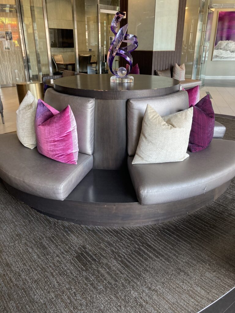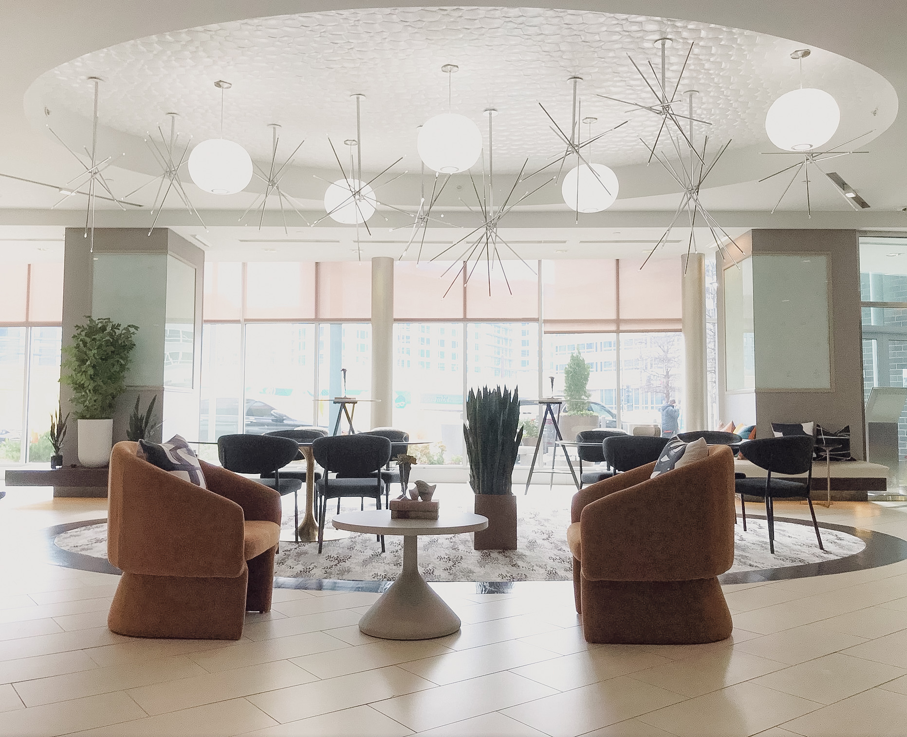
Initially opened in 2014, this 14-story multifamily building is getting a new sister property – The Burton – right next door later this year. That meant it was time for Elevation also to get a facelift. Working within the available budget, SR/A devised a phased refresh plan to give new life and increased functionality to the eight-year–old establishment.
Before
After
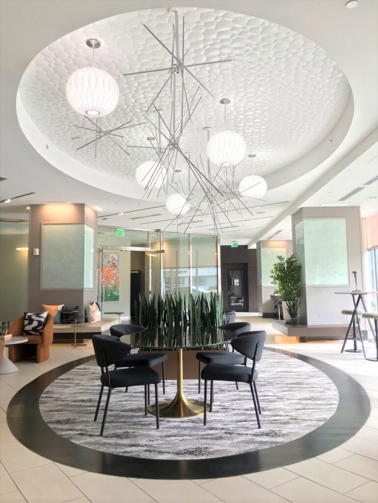
Rethinking the space plan was a top priority. The existing central banquette took up a lot of square footage and was not serving residents’ needs in today’s world of working from home. Removing the banquette enabled us to replace the carpet in the central inset and select new, flexible furniture.
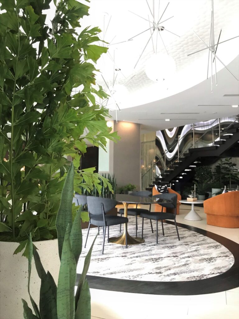
The original design included a lot of purples (and I mean a lot!). One refresh goal was to thoughtfully incorporate other colors to tone down the onslaught of purple without replacing every purple item on the first level. Replacing critical materials, as well as focal artwork, helped tone down the color. The new design includes a large number of plants and greenery. In addition to creating a welcoming, biophilic environment, these plants help “bridge” the color transition throughout the space.
Before
After
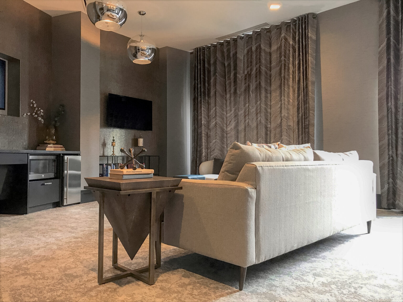
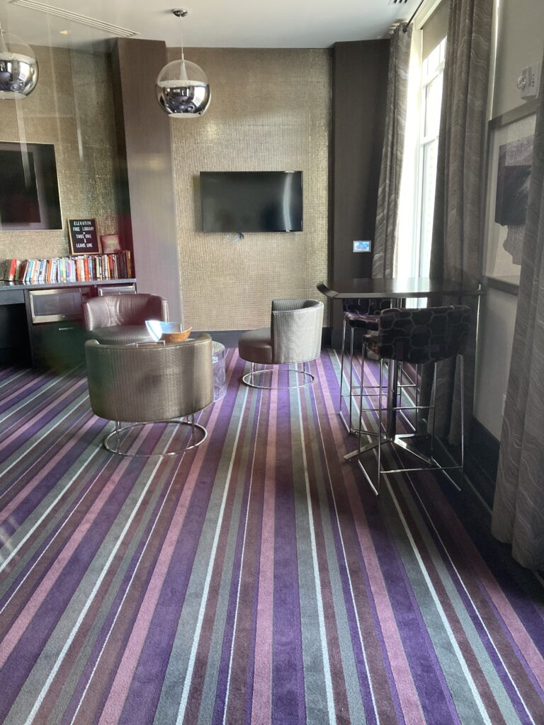
A small lounge off the lobby, the parlor received new carpet and a new space plan and furniture. We worked on the latest design around the existing tile wall to manage funds. New accessories and improved function for the resident’s lending library round out the upgrades in this space.
Still on the table for later phases are addressing the focal stair wall, concierge desk, and the second-floor clubroom. Renovation of the corridors will be starting soon (I can’t wait to share those pictures!).
Jennie is the Renovation Projects Manager at SR/A. She has been committed to the company for over seven years.
