In the collective moment that we find ourselves, we are experiencing how critical it is for our homes to be a sanctuary. A place we are happy to arrive to, and at least for the foreseeable future, to settle and stay in.
In a multifamily community, an immediate way a design firm can assist in this is to create the right foundation for residents to build on in their personal units.
Some developers want that perfect neutral backdrop that any potential resident can visit and picture themselves in. Others want that wow factor that gives the prospect an aspirational vision of what living in their building could be like. Either way, the design decisions are key.
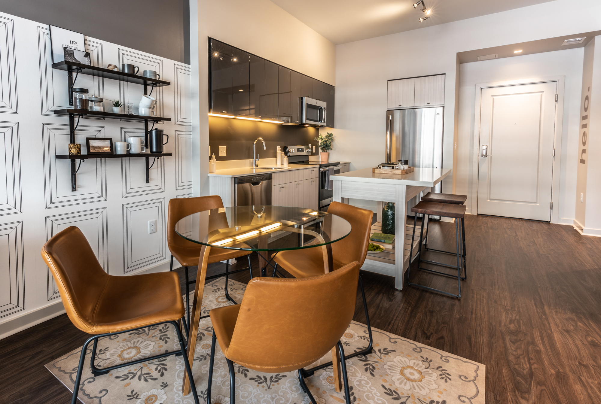
Most buildings will offer two color schemes for their units, a “dark” and a “light.” This is to give residents the option of how they want their space to feel. Do they prefer dark and cozy? Or is bright and airy their goal? When we are making finish selections, we want to make sure that the cozy scheme doesn’t veer into the visually heavy territory; and that the airy scheme doesn’t feel too stark or uninviting.
Here are a few concepts and ideas to implement them that we at SR/A consider in the design process:
Think through the level of contrast you want.
- Black or charcoal paired with white gives a space energy and strength. It can have a classic look or a bold and modern feel, depending on the selections.
- If you prefer strong colors but don’t want the high contrast, find a way to bring in the middle tones that connect the two. Maybe it is a patterned tile as the backsplash or brick that marries the cream walls with a dark floor.

Material Selection + Model Design
Find selections that have movement to them.
- A beautiful wood with a range of tones and perhaps even a lively grain to serve as a warm foundation for the space.
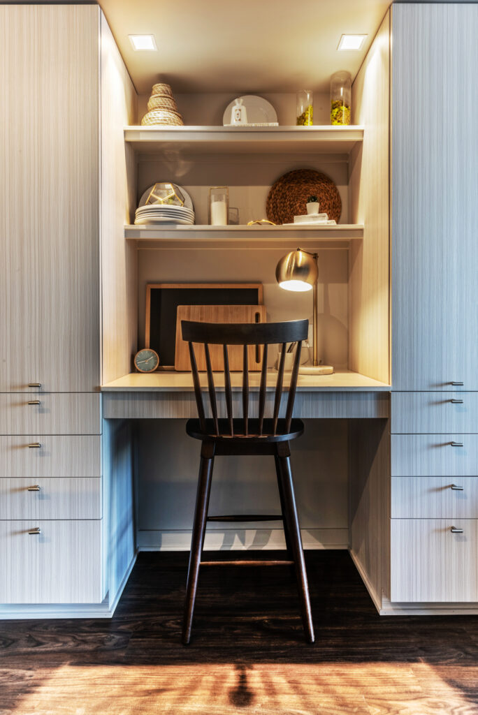
- Tile or cabinetry that has subtle tonal changes that are anything but boring.
Look beyond just the selection. Creative installation can bring something to the table.
- Take a basic subway tile and find a fun, new way to lay it out. One of my favorites is a vertical stack. Delightfully modern and fresh!
- Grout can often be forgotten, but these days it comes in all kinds of colors. Are you bold enough to try a blue with that white tile?
- Think outside the tile box. If you are looking for a clean aesthetic, forgo the tile backsplash altogether and continue the quartz countertop up the back wall to meet with the upper cabinets. Can’t afford that? Rich paint will do!

Material Selection + Model Design
Paint can be your best friend
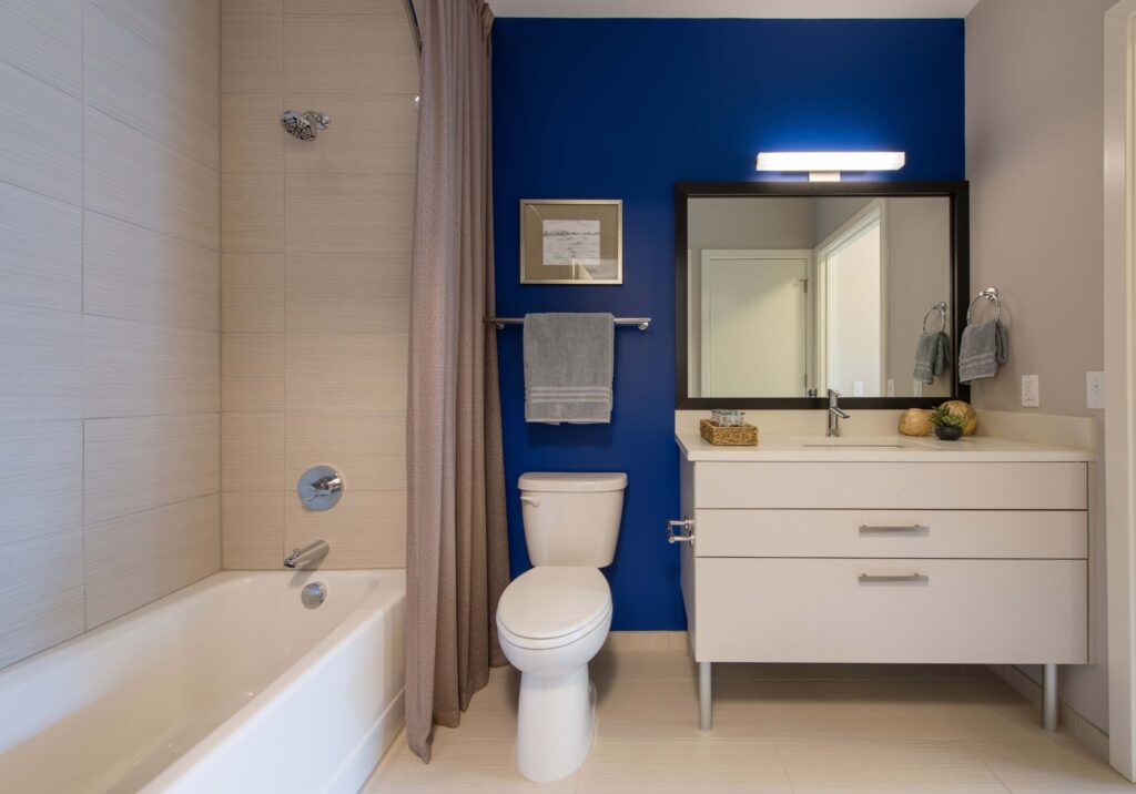
- One surefire way to take a space from bland to bold is paint. Pick a small space like a bathroom or an accent wall and go for it!
- Some apartment communities offer new residents a handful of accent colors they will paint upon move in. Others may allow residents to paint a choice of their own so long as the walls are returned to white upon move out.
- A warm greige (that’s designer-lingo for grey-beige) paint can provide a soft and universal backdrop for the resident’s personality and style to shine.

Model Design
This is a brief list of some of the things the SR/A team considers when designing a unit. Our process and decisions are motivated by a desire to provide a sense of interest and ease to the people who live in the apartment communities we help create.
We hope you and your loved ones are safely nestled in your sanctuary, drawing calm and comfort from your surroundings.
About the Author:
Katharine Gatz is a Senior Designer and Projects Manager at SR/A Interior Design. She holds a passion for helping multi-family developers create communities that both attract and retain residents through functional, innovative, and buzz-worthy designs.